Infographics is the rarest case when 1 + 1 does not equal 2. Any article accompanied by well-thought infographics gets likes and is remembered 4 times more and longer. In practical terms it means that you may create 4 times less quality content to get roughly the same result.
Infographics is considered good if everyone decodes its message in the same way. Naturally, this message should be related to the article content or be its prerequisite. Instantly grasped hidden message interwoven with the article takeaways is what makes infographics outstanding.
Infographics is pervasive; any image we publish on the LinkedIn platform is considered infographic piece due to the B2B nature of this platform. The majority of users do not aware of this. In that respect, 90% of infographics on LinkedIn lack messaging. It is just background noise littering space and diverting the reader's attention. Personally, I skip the textual part if infographics is just nice picture.
Compelling infographics creation is an art starting from this simple step. Search the Google images for your article title. If you find nothing that conveys the exact meaning, you have a chance to be on the Google first page by creating your own infographics.
For this I prefer the Adobe Illustrator. It is accompanied by rich collection of the design elements – the quickest way to build your prototype. This rough approximation of what you need, will further undergo a number of changes articulating the encoded message.
The fact is that in creating good infographics the subject matter knowledge trumps the graphic designing experience. Do-it-yourself infographics starts not from mastering the Illustrator, but from searching for visual clichés (never use them!), daily workout for imagination and inspiration, and building the palette of graphical options.
Below is an illustration of how design experience, imagination and the subject matter knowledge work together.
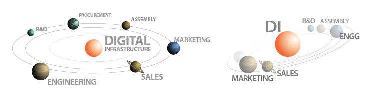
Both explains the meaning of "digital infrastructure" introduced recently. But the left does not convey the senses of tension and motion. In addition, grouping the planets overloads the right image with a second important message – marketing and sales come first.
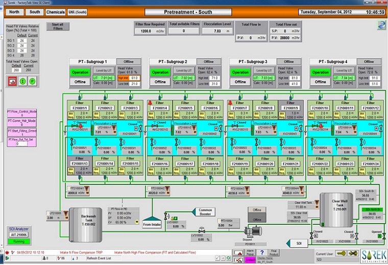
Engineering shown in the rear is also driven by infographics - P&ID and HMI screens. Their ugly graphic design is a norm.
The HMI anti-pattern below is from real megaproject (Israel, 2012). It violates all basic principles of good infographics: too many colors, wrong selection of color palette and background, diversion of attention to unimportant elements (visual distraction), screen excessive clutter, extraneous information, bad layout, etc. Ugly design works in opposite direction; instead of raising situational awareness, it increases cognitive load on the plant operators, contributing to errors and delays in decision making.